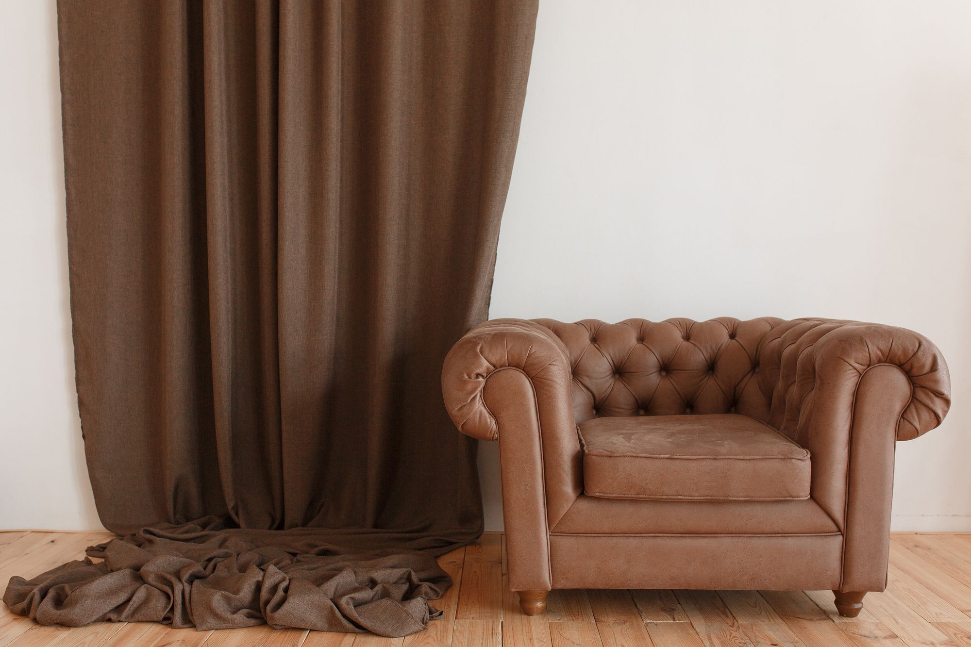
Brown is often dubbed as a 'neutral' in the fashion and interior design worlds. Whether you’re trying to pick the perfect outfit or determining the best shade for your living room, brown can serve as a versatile backdrop.
But which colors truly complement and elevate brown? This guide will dive into the myriad of shades that pair beautifully with brown and help breathe new life into it.
Understanding the Basics: The Color Brown
Before diving into the perfect pairings, it’s vital to grasp the nuances of brown. At its core, brown is a natural color, often associated with the earth, wood, and organic materials. It can range from a light, almost beige shade to a dark, almost chocolate hue. This vast spectrum allows for a plethora of complementary colors.
Complementary Colors to Go with Brown
1. Cream and Off-White
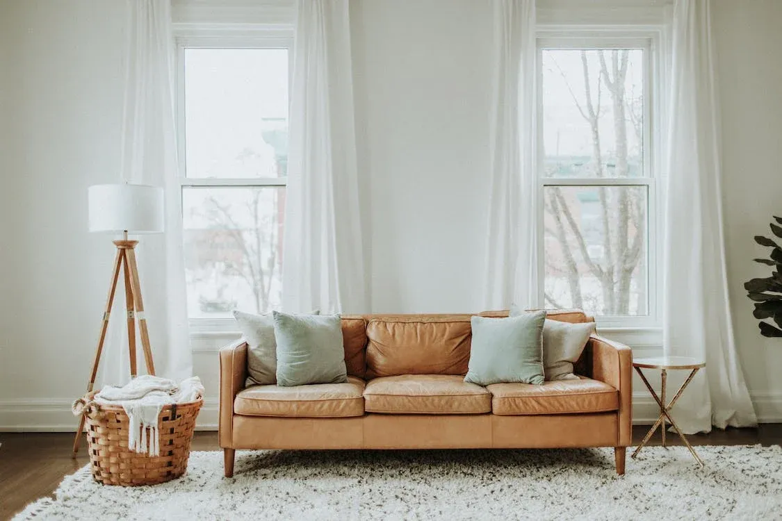
Starting with the basics, cream or off-white tones blend seamlessly with brown. This pairing exudes a calm and sophisticated energy. Think of a chocolate brown leather sofa with off-white cushions or a brown dress paired with cream accessories. The contrast between the two adds depth, while also maintaining an earthy and organic feel.
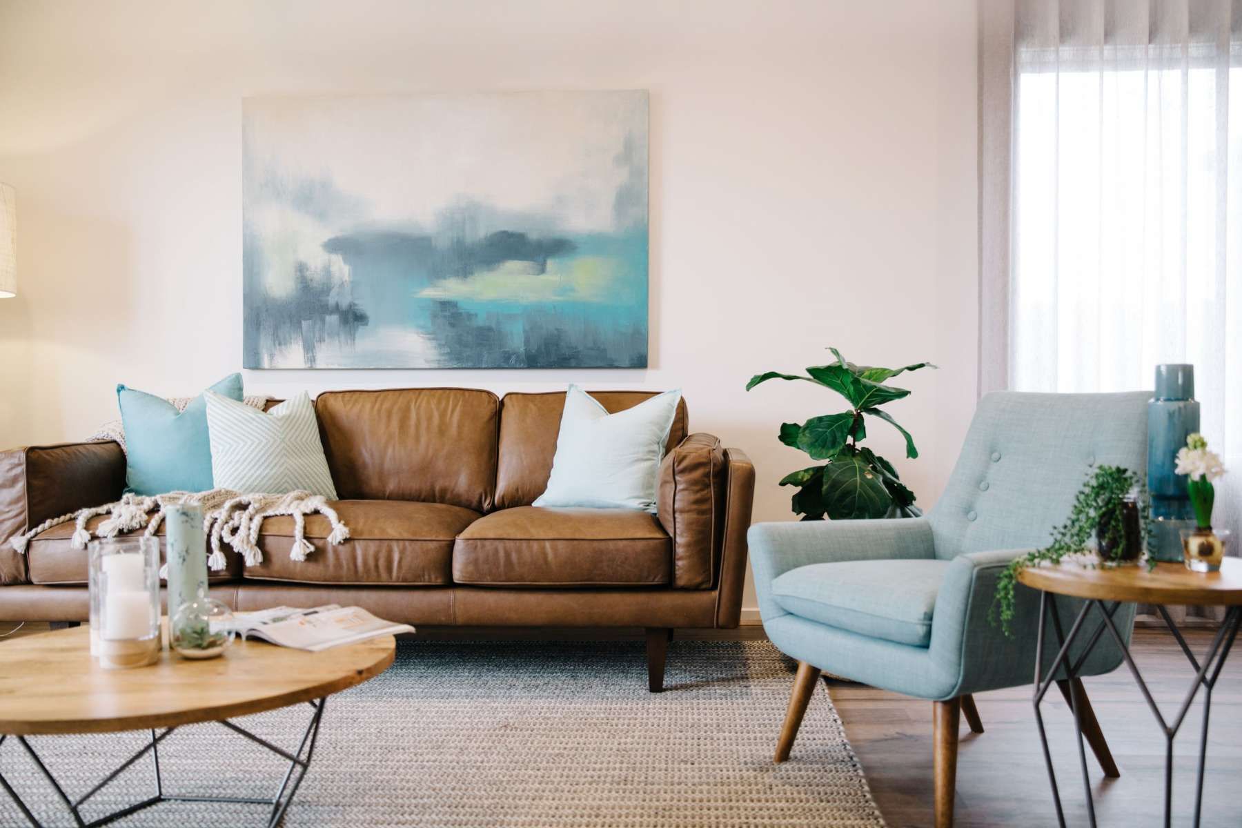
2. Turquoise and Teal
For a pop of color, turquoise or teal can be a striking choice. These shades create a vibrant contrast with brown, especially with darker shades. The cooling effect of turquoise, reminiscent of tropical oceans, alongside the warm, grounding brown, provides a balanced visual appeal. For those looking to make a statement, a brown suit with a turquoise tie or scarf, or a living room with turquoise accents against a brown backdrop, can be quite arresting.
3. Burnt Orange and Rust
Staying within the warm color palette, burnt orange and rust are natural companions for brown. These colors add a touch of autumnal charm and are especially effective for cozy spaces or outfits. Imagine rust-colored drapes in a room with dark brown furniture, or a rust scarf complementing a brown overcoat.
4. Green (Especially Olive and Sage)
Green is another earthy color that, when chosen in the right shade, works wonders with brown. Olive and sage greens are top picks, enhancing the organic vibe that brown naturally possesses. Whether it's an olive green top paired with brown trousers or sage walls in a room with brown furnishings, the combo feels harmonious and grounded.
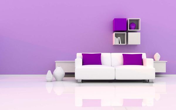
5. Navy Blue
For a more sophisticated and somewhat unexpected match, navy blue stands out. This combination exudes a touch of modernity and class. A navy blue blazer over a brown dress shirt or a room with navy accents against brown tones can provide a crisp, contemporary feel.
6. Gold and Brass
If you're looking to elevate brown to a more luxurious level, gold and brass are your go-to options. These metallics add a touch of opulence. In fashion, a brown dress with gold accessories or in interiors, a brown-dominated room with brass light fixtures can truly shine.
7. Deep Red and Maroon
Deep reds, like maroon or burgundy, provide a rich contrast to brown, especially lighter shades. These hues invoke a sense of warmth and luxury. A maroon dress paired with brown shoes or a brown room with deep red accents can be both cozy and luxurious.
Incorporating Patterns and Textures
Apart from solid colors, integrating patterns and textures can further enhance the brown-centric palette. For instance, a brown and white striped shirt or a floral-patterned brown wallpaper can break the monotony and add a layer of visual interest.
Expanding on the Emotional Impact of Brown Combinations
Another aspect worth exploring when considering colors to pair with brown is the emotional and psychological impact they have on the observer.
1. Brown and Cream/Off-White
This pairing creates a feeling of serenity and calmness. Light tones like cream evoke a sense of spaciousness, cleanliness, and purity. Combined with the stabilizing force of brown, these two colors often imbue spaces and outfits with a relaxed, airy atmosphere.
2. Brown and Turquoise/Teal
Such vibrant contrasts invariably evoke feelings of energy, creativity, and zest. The blue-green tones of turquoise stimulate thoughts of tropical beaches and serene oceans, making this combination perfect for those seeking a rejuvenating and refreshing ambiance.
3. Brown and Burnt Orange/Rust
As mentioned earlier, these colors can transport someone to a cozy autumn setting. The combo is inherently warm, inviting, and nostalgic, ideal for spaces or outfits meant to make one feel secure and enveloped.
4. Brown and Green
The epitome of nature, brown paired with shades of green like olive or sage, feels organic and earthy. It can evoke feelings of growth, freshness, and being grounded.
5. Brown and Navy Blue
This duo radiates professionalism, trust, and sophistication. Navy blue represents depth, expertise, and stability, making it a favored choice in corporate environments. Paired with brown, it adds a touch of warmth, making it less austere.
6. Brown and Gold/Brass
A combination that screams luxury and opulence. Gold represents success, quality, and prestige. When complemented by the earthy tones of brown, it becomes more approachable while maintaining its grandeur.
7. Brown and Deep Red/Maroon
This sultry pairing can invoke deep emotions, passion, and a sense of luxury. Deep reds, with their richness, add depth and drama to the neutral base of brown.
A Few Quick Tips for Implementing Brown Pairings
Layering in Fashion
When dressing, start with a brown base, be it trousers or a dress. Gradually layer with complementary colors using accessories, jackets, or scarves.
Interior Design Balance
For interiors, if brown dominates the space (like a large sofa), use complementary colors in smaller accessories or wall art to avoid overwhelming the space.
Nature is the Best Teacher
If ever in doubt, take inspiration from nature. After all, it's where brown and its complementary colors co-exist in perfect harmony.
Delving Deeper: Cultural Interpretations and Brown
In addition to the emotional responses elicited by color combinations, the cultural context in which brown and its pairings are used can also influence perceptions. Around the world, colors have various symbolic meanings, and brown is no exception.
1. Brown in Different Cultures
Western cultures
Often associate brown with earth, reliability, and warmth. It also signifies autumn and its associated sentiments – change, maturity, and preparation.
Eastern cultures
Particularly in India, sometimes associate brown with mourning, though it's less commonly referenced than white in this context.
Latin American cultures
Brown has spiritual connotations, connecting with the earth and the indigenous roots of the land.
Understanding these cultural nuances can be crucial when selecting pairings for brown, especially in global or multicultural contexts.
2. Pairing Brown Globally
Given the various cultural interpretations of brown, some universal color pairings can transcend borders:
Brown and Gold
In many cultures, both east and west, the blend of earthy brown with opulent gold symbolizes prosperity and abundance.
Brown and Green
Universally, this duo echoes nature and signifies growth, renewal, and harmony.
3. Artistic Uses of Brown
Over time, brown has played a pivotal role in art across different cultures. For instance:
Renaissance Art
Artists utilized brown undertones to bring depth and realism to their paintings. The pairing of brown with vivid blues and deep reds was prevalent, creating contrasts that depicted emotions, stories, and depth.
Contemporary Art
Modern artists play with brown in abstract forms, often juxtaposing it with bold colors like neon greens or bright pinks to challenge traditional perceptions and elicit thought.
4. Tips for Culturally Conscious Brown Pairings
Research is Key
If you're designing for a global audience, a brief study of the cultural interpretations of your chosen colors can ensure your designs resonate well.
Versatility of Neutrals
When in doubt, pairing brown with other neutrals like beige, tan, or gray can be a safe bet. Such combinations are generally well-received universally.
Celebrating Diversity
Recognize that brown, being a color so deeply rooted in nature and earth, resonates with the idea of unity and interconnectedness. Embracing various color pairings can be a nod to global inclusivity.
Beyond Fashion and Interiors: Branding and Marketing
While our exploration of brown has primarily revolved around fashion and interior design, its influence is evident in other fields too, notably branding and marketing. Let's delve into how businesses leverage brown and its harmonious pairings.
1. Brand Perception with Brown
In the world of branding, colors play an instrumental role in conveying a company's identity and values.
Trustworthiness
Brands that wish to portray reliability and trustworthiness, such as UPS, leverage the stability of brown in their logos and marketing materials.
Organic & Natural
Companies focusing on natural products or eco-friendly initiatives might use brown to underscore their connection to the earth. A classic example is the coffee industry, with brands like Starbucks emphasizing the rich, earthy tones of their primary product.
2. Marketing and Advertisements
Brown's neutral palette offers a canvas for brands to play with emotions, highlight products, or convey particular messages.
Highlighting Luxury
Brands that offer luxury goods, like premium chocolates or high-end leather products, might pair brown with gold or deep red to evoke a sense of opulence.
Evoking Warmth
For campaigns aimed at eliciting feelings of warmth, comfort, or nostalgia, brown can be paired with softer tones like cream, rust, or sage green.
3. Web and App Design
In the digital space, the use of color is crucial for user experience.
Neutral Backgrounds
Brown, especially lighter shades, can offer a subtle background on websites or apps, allowing for content, especially vibrant visuals, to stand out.
Buttons and Calls to Action
Darker shades of brown can be paired with contrasting colors like teal or gold for buttons, guiding user actions effectively.
4. Packaging Design
The colors chosen for packaging can influence purchase decisions significantly.
Eco-friendly Brands
With sustainability becoming paramount, many brands opt for brown, recycled paper or packaging, emphasizing their commitment to the environment.
Luxury Packaging
On the other spectrum, dark brown paired with gold or brass accents can be seen in high-end product packaging, denoting luxury and exclusivity.
Tips for Brands Considering Brown
Know Your Audience
Understanding the target demographic's cultural and emotional response to brown and its pairings can guide branding decisions.
Consistency is Key
Once a color palette revolving around brown is chosen, maintain consistency across all platforms and materials for brand recognition.
Test and Iterate
Before finalizing, test different shades and pairings to see what resonates best with your audience. Analytics, especially in digital marketing, can offer insights.
Beyond the Aesthetic: Psychological and Sociological Dimensions
Brown, often overlooked in favor of its more vibrant counterparts, has profound effects on our psyche and social interactions. This section aims to shed light on these less-discussed facets, offering a holistic perspective on the role of brown and its complementary pairings.
1. Psychological Influences of Brown
Colors can evoke specific emotions and reactions in individuals, and brown is no exception.
Safety and Security
Being reminiscent of the earth and nature, brown can instill feelings of safety, grounding, and reliability. This might explain why many homes and communal spaces have brown as a foundational color.
Comfort and Warmth
The association of brown with materials like wood and leather, which are often linked to warmth and coziness, reinforces feelings of comfort.
2. Brown in Social Contexts
Beyond individual psychology, brown has various implications in social scenarios.
Professionalism and Practicality
In professional settings, brown attire—whether it's a suit, shoes, or accessories—often conveys practicality and a no-nonsense attitude.
Inclusivity and Neutrality
Given its neutral character, brown can be seen as inclusive, not favoring any extreme. This is why it’s a preferred choice in many communal settings or public spaces.
3. Brown in Everyday Life
Everyday encounters with the color brown might seem mundane but have underlying significance.
Food and Cuisine
Many comfort foods, like chocolate, coffee, or bread, are brown. This color, in a culinary context, often signals richness, warmth, and satiety.
Nature and Mindfulness
The prevalence of brown in nature, in trees, soil, and mountains, makes it a color often associated with mindfulness practices, grounding exercises, and eco-therapy.
4. Pairing Brown in Psychological and Social Spaces
Understanding how colors that pair with brown influence our psyche and social interactions can be enlightening.
Brown and Blue
Blue, a color representing calm and tranquility, when paired with brown, can create a setting of serene stability. This combination is often seen in therapeutic spaces.
Brown and Green
As previously discussed, this pairing is symbolic of nature. In social contexts, it can signify growth, harmony, and unity.
Brown and Red
While brown grounds, red energizes. Together, they can stimulate action yet provide a sense of security. This is why they are often found in collaborative spaces or brainstorming rooms.
Practical Tips for Integrating Brown Mindfully
Personal Spaces
If you're looking to create a sanctuary of calm and grounding, use brown as a base and accent with colors that resonate with your personal energy.
Work Environments
For spaces meant for collaboration, innovation, or deep thinking, consider the attributes of brown and choose pairings that foster the desired ambiance.
Social Design
If you’re curating a social event or community space, leverage brown and its pairings to create an atmosphere that aligns with the intended mood and message.
Conclusion: The Universality of the Color Brown
The myriad of brown shades offers an unparalleled depth and versatility that few other colors can match. An interior designer often leans into the brown color scheme, recognizing its unique capability to set both a calming and sophisticated tone in spaces. From the warm embrace of wooden furniture to the contemporary touch of pale blue accents against brown walls, every choice in a brown color palette tells a story.
The allure of brown hues, ranging from the gentle embrace of light brown to the profound depth of darker shades, presents endless opportunities for creativity. Cool tones, when paired with a dominant brown shade, bring out a refreshing contrast, making spaces feel both grounded and airy. Think of the serenity evoked by dark green plants against light brown furnishings or the elegance of metallic decor amidst rich brown backgrounds.
The dynamic interplay between various elements within the brown spectrum proves its timeless appeal. Whether you're a homeowner seeking inspiration or an interior designer crafting masterpieces, the harmonious blend of brown shades with both warm and cool tones ensures a palette that's both inviting and endlessly inspiring.