Are you seeking to enhance the elegance and beauty of your space by incorporating shades of purple into your interior design, fashion, or art? Understanding the colors that beautifully blend with purple is essential to achieving your vision. This article explores the harmonious colors that pair with purple, ensuring your design choices hit the mark every time.
Purple, the blend of tranquil blue and fiery red, stands as a color that embodies the perfect balance between calmness and passion. Whether you prefer the subtle appeal of lavender or the deep allure of eggplant, there is a broad spectrum of colors that can work harmoniously with varying shades of purple.
Complementary Colors
The color wheel helps us understand color relationships and harmonies better. It suggests that the complementary color to purple is yellow. This duo creates a visually striking contrast, as each color makes the other appear more vibrant. Whether you're designing a room or selecting a unique outfit, pairing purple with yellow results in an eye-catching combination that's hard to ignore.
Analogous Colors
Next, let's explore analogous colors. These are colors located next to each other on the color wheel, creating a cohesive and comfortable look. In the case of purple, these are blue and pink. Using a deep royal blue or a soft baby pink with purple can help maintain a cool color palette that's soothing to the eyes.
Neutral Tones
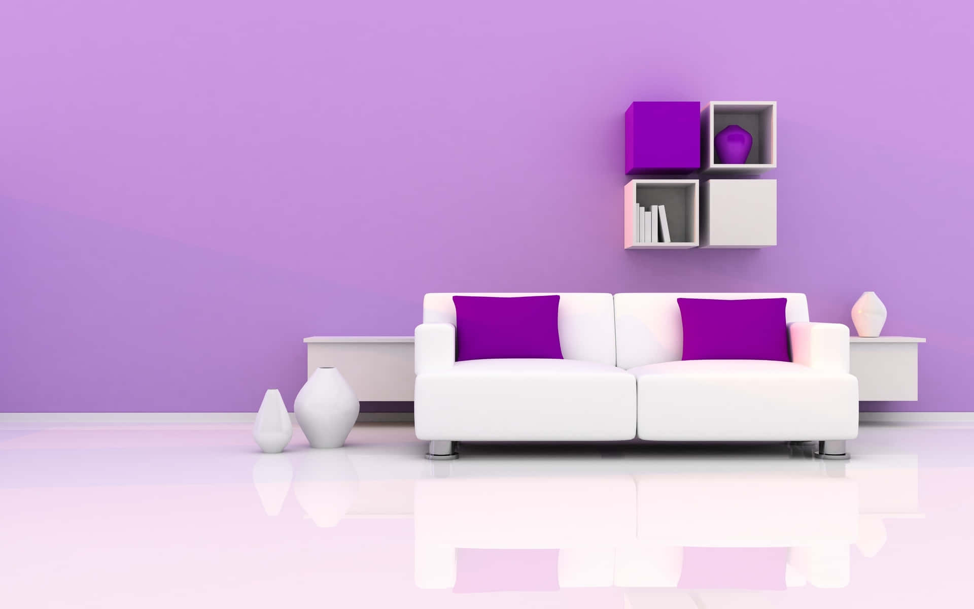
Neutral colors like white, black, grey, and beige, are also fantastic pairings with purple. White creates a stunning contrast, especially with darker shades of purple, resulting in a clean, modern look. Black, on the other hand, brings out an edgy, dramatic vibe when paired with purple. Grey and beige bring in a subtle and sophisticated aspect to the mix, toning down the intensity of deep purples, or accentuating lighter shades.
Earth Tones
Earth tones such as olive green or burnt orange can also be splendidly paired with purple to create a warm and inviting atmosphere. These colors bring out a rustic charm, transforming your space into a cozy haven.
Color Triads
Lastly, consider using color triads for a vibrant and balanced color scheme. When purple is part of a color triad, it is accompanied by orange and green, forming a harmonious trio that's pleasing to the eye.
Understanding the art of color matching is key to creating appealing designs, whether it's for your home, wardrobe, or digital art. And remember, the most beautiful part about colors is their flexibility and adaptability. Don't be afraid to experiment with different hues and tones until you find the perfect match for your purple.
Key Takeaways:
- Complementary color to purple is yellow, creating a vibrant contrast.
- Analogous colors like blue and pink create a cohesive, soothing look with purple.
- Neutral colors like white, black, grey, and beige blend harmoniously with all shades of purple.
- Earth tones like olive green or burnt orange bring out a rustic charm when paired with purple.
- Color triads involving purple typically include orange and green, forming a vibrant and balanced color scheme.
With the understanding of how colors interact with each other, particularly with purple, you can confidently create beautiful, harmonious designs. From vibrant contrasts to elegant monochrome schemes, the colors that go with purple are truly vast and versatile, ready to bring your design visions to life.
Conclusion
Muted Shade and Royal Purple
In the grand scheme of color palettes, dark purple holds a regal and luxurious charm that is hard to overlook. Imagine a room with deep purple walls, with the purple shade intensified by elegant purple accents such as artwork or cushions. Pairing this with light blue furniture or decor elements can create a harmonious color combination that is both vibrant and soothing. Soft French blue creates a stunning contrast with the purple walls, bringing in an element of tranquillity amidst the regal purple surroundings. Alternatively, navy blue can be used to deepen the color palette and enhance the richness of the purple tones, while light purple curtains can add a softer, whimsical touch.
The color purple, in its various shades, can also work in harmony with muted shades and cool tones. Picture pale lavender walls complemented by white or gray décor, allowing the color purple to subtly stand out without being overpowering. The interplay of these colors, particularly when enhanced by natural light, can create an atmosphere that is both serene and sophisticated. A combination of purple shades, from deep plum to light lavender, can create a dynamic yet cohesive aesthetic in any space, such as a bedroom or dining room.
Exploring the darker side of the purple palette can also provide dramatic and impactful results. A dining room with darker purple walls, for instance, exudes a sense of opulence and drama. This effect can be balanced by incorporating lighter elements such as bright white molding or pastel shades in the decor. Light purple, when combined with these softer tones, can create a calming and relaxing atmosphere. Whether you're looking for the boldness of dark purple or the tranquillity of pastel shades, the color purple, in all its diversity, offers endless possibilities for creating stunning and harmonious color schemes.